Design Improvement
at Inakaya Japanese Restaurant
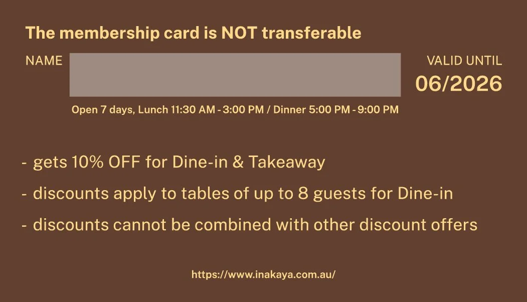
While working at a Japanese restaurant in Sydney as my first job during the Working Holiday, I was commissioned to design a membership card that would naturally appeal to local customers.
As a front-of-house staff member, I also identified operational issues such as inconsistent workflows, repeated customer inquiries, and a lack of standardized training for new staff.
Based on these insights, I independently created a FoH manual to improve service consistency and staff communication, providing a practical on-site design solution.
Field
Service & Visual Communication Design
Type
Self-initiated (In-house) Project
Duration
06/2025 - 09/2025
Tools
Indesign, Illustrator
1) Membership Card Design
Previous Design
Observation & Evaluation


Inspiration from the Store

To make the card reminiscent of our restaurant, we plan to incorporate graphics observed within the Inakaya interior, such as wall elements and the curtain at the kitchen entrance.
Source: Pixabay (free for commercial use)
Design Direction & Concept


Design Proposal
The placement of the logo looks a bit awkward.
The spacing on both sides of ‘FAMILY CARD’ is uneven.
→ A cleaner layout and alignment are needed.
While the text on the back is all in uppercase, which gives a sense of consistency,
it’s hard to distinguish which information is more important overall.
→ The hierarchy of text should be adjusted according to its importance.

I used Public Sans, the typeface employed by the NSW government,
to provide customers with a sense of familiarity.
The back of the card references the layout of Australian bank cards.
Since this structure is widely encountered in everyday life, it enables
intuitive information delivery while naturally conveying a sense of reliability.
To avoid confusing customers with drastic color changes, we selected tones similar to the existing business card and added a red accent reminiscent
of Japan as a highlight color.


A version of the design draft was created applying only the background patterns or colors.
The wood pattern was considered too overwhelming and excluded to account for print output, and the final draft was completed reflecting feedback that the original brown color was too dark.